Regular readers will recall that I wrote a simple blog reader for Windows 8, or rather adapted Microsoft’s sample. The details are here.
This is a Windows Store app – a description I am trying to get used to after being assured by Microsoft developer division Corp VP Soma Somasegar that this really is what we should call them – though my topic is really the design style, which used to be called Metro but is now, hmm, Windows Store app design style?
No matter, the subject that caught my attention is that typical Windows Store apps have low information density. This seems to be partly due to Microsoft’s design guidelines and samples, and partly due to the default controls which are so boldly drawn and widely spaced that you end up with little information to view.
Part of the rationale is to make touch targets easy to hit with fat fingers, but it seems to go beyond that. We should bear in mind that Windows Store apps will also be used on screens that lack touch input.
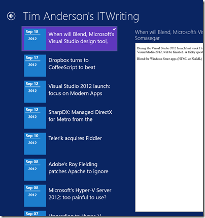
I am writing this on a Windows 8 box with a 1920 x 1080 display. Here is my blog reader, which displays a mere 7 items in the list of posts:
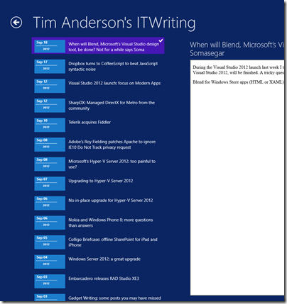
This was based on Microsoft’s sample, and the font sizes and spacing come from there. I had a poke around, and after a certain amount of effort figuring out which values to change in the list’s item template, came up with a slightly denser list which manages to show 14 items in the list. The items are still easily large enough to tap with confidence.
Games aside though, I am noticing that other Windows Store apps also have low information density. Tweetro, for example, a Twitter client, shows only 11 tweets to view on my large display.
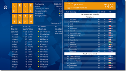
The densest display I can find quickly is in Wordament, which is a game but a text-centric one:
I have noticed this low information density issue less with iPad apps. Two reasons. One is that iOS does not push you in the same way towards such extremely large-looking apps. The other is that you only run iOS on either iPhone or iPad, not on large desktop displays.
Is Windows 8 pushing developers too far towards apps with low information density, or has Microsoft got it right? It is true that developers historically have often tried to push too much information onto single screens, while designers mitigate this with more white space and better layouts. I wonder though whether Windows 8 store apps have swung too far in the opposite direction.


Tablet designs may be an extreme of low information density, but desktop developers could certainly use a push in that direction IMO. Far too many native applications and webpages use extremely tiny font sizes that are hard to read on contemporary high-dpi monitors.
When I click through to your PNG samples on my 24″ 2560×1440 monitor, I find the first sample decently readable whereas the second sample is unreadable at my normal viewing distance — the text is far too small. I should hope that the actual app scales correctly for 120 dpi mode, though, which would mitigate the effect.
Another reason for large fonts is that DirectWrite, the new Microsoft font rendering tech font, is quite poor at rendering small fonts (less so than GDI+, but still poor), and they render blurry, with low contrast and poor legibility.
This is also why FireFox, which switched to DirectWrite in FF4, switched back to using GDI in FF7 for common fonts in small sizes (ie. much of the web). Note that this is also why IE9 and WPF applications also typically appear “blurry” on displays with standard dpi.
Apple is rendering small font quite well in iOS, so small fonts aren’t such an issue on the iPad or iPhone, since they stay quite readable.
@Eric DirectWrite isn’t a new font rendering tech, it has been around for a while, before windows 8. It is just a hardware accelerated way to render fonts. Some fonts however are not meant to be HW rendered and some applications incorrectly dishonors windows default settings on when to use cleartype font and when not to. There have been numerous updates to the fonts to handle the subpixel rendering, for instance http://support.microsoft.com/kb/2545698
If done right, there are no blurry issues in WPF.
The reason is actually mostly the hinting in the fonts, where DirectWrite does a more correct job at actually rendering the font as it was meant to be rendered. This unfortunately breaks a lot of text out there because they chose the font as to have it looked in GDI, not as how it was supposed to look. GDI was broken, but that’s that people used when the chose the fonts, thus now we think that DirectWrite is broken, that actually fixed things. It is a IE6 thing all over again, but for fonts.
FF7 didn’t switch to GDI, they implemented a exception list for fonts that just doesn’t render well in GDI, but since people designed it while looking at it with GDI it now looks completely broken in DirectWrite. You can however override this to get native rendering in FF7. I would more call that a “quirks” mode. I myself think it is a step backwards instead of moving the world off GDI’s wrong rendering. But I guess forcing all web sites out there to redesign their fonts choices is a major hurdle if you want to have market share left. All browsers would have to do this.
A very good read up is this
http://blog.mozilla.org/nattokirai/2011/08/11/directwrite-text-rendering-in-firefox-6/
http://msdn.microsoft.com/en-us/library/windows/desktop/dd371554(v=vs.85).aspx
Note however FF is still using DirectWrite, just with a different setting for some fonts that emulates GDI, because HW acceleration is a good thing.
So no, I don’t think that is the reason for large fonts in windows 8. It has much more to do with the full screen consumption era than the high density production era we have been in. I am not sure which is correct, but the mobile phones started this along with a surge of LCD TV. Which has had a backwards effect on screen resolutions on laptops which has actually gone backwards.
I sincerely doubt that desktop apps will follow this, it just isn’t a productive metaphor to be in, the multi window desktop is just more productive. You can quickly feel this be using the new “metro” mail app compared to for instance windows live mail which is the free comparable app in desktop mode.
However I do believe that Microsoft’s assumption that most people only have one or two windows open is the reason for this, the masses just aren’t doing as complex things as the more, but less plentiful, technical people does. For us there is the desktop mode.
I myself find it utterly constraining, but then again I find tablets/slate constraining, much for the same reasons. But if you just read books/papers and which youtube…
The biggest scare to me is the dual IE modes, that don’t render the same, what is up with that strategy.
Ehm, Windows 8 auto spell correct features are not always gentle to what gets written without me noticing. Perhaps a nice full screen “metro” app could popup with a sole purpose of authoring text and then send me back to the web page.. The push for HTML has brought usability backwards for the sake of operability..
Where will the push for slate and tablets leave us in the productivity world.