Windows 8 is now available for download on MSDN and TechNet, which means the final code is in the hands of a large number of Microsoft-platform professionals. I have been trying out the release, which I installed both as an upgrade over the Release Preview (it does not really upgrade it, but does keep a few settings and documents), and as a clean install on a virtual machine.
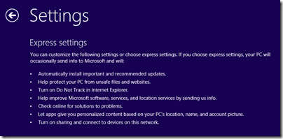
The first thing I noticed was the default settings:
You can click Customize to get more information and control over these settings, and I recommend that you do. The one that troubles me most is:
Let apps give you personalized content based on your PC’s location, name, and account picture.
I am not sure how the picture helps with that, but presume it is code for giving apps permission to use it and potentially to share it. The matter of sharing location is difficult; it certainly makes sense for numerous apps from Weather to TripAdvisor; but allowing third-parties to track your physical location is a big ask. Still, if you want the full experience you have to compromise your privacy; that is the choice.
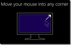
Next I was interested to see what guidance Microsoft would give to new users. This appeared just after setup and before the Start screen is shown for the first time, and takes the form of one or two short but insistent animations:
When I installed on a tablet, I got a second animation about swiping in from the sides.
It seems to me that Microsoft is trusting too much that users will enjoy “discovering” the Windows 8 user interface. Perhaps some will; but I was expecting to be offered something like a video and an introductory manual. I think users will click past this and still get stuck.
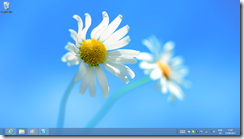
Next, I noticed the new aero-less desktop theme.
I do not have strong feelings about this, but admit to some puzzlement about why Aero translucency has gone. Power consumption is a possibility, but why not offer it as an option for desktop users, for example? Still, this is a small detail as far as I am concerned.
Microsoft has chosen a flower for the default desktop background, not unpleasant though a bold choice in some ways. A flower is a strong, evocative image that some will therefore react against, given that a desktop background can be a sort of personal statement.
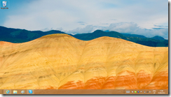
Not many desktop backgrounds are supplied on the install DVD. There is a Flowers theme and another called Earth, which I found rather bleak.
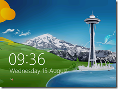
The default lock screen is a painting based, I think, on the Seattle Space Needle.
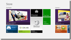
Disappointments? My biggest disappointment is with the RTM Store. I was hoping for a host of new applications, but in fact the Store, while containing a few new apps, is still sparsely populated.
This is a problem for Microsoft because Windows 8 badly needs a few compelling apps to persuade doubters that Metro, sorry Modern UI, is not worthless. I love Wordament, yes, but in general we still await great Windows 8 apps.
The best news, I guess, is that I have little to say about the install process. It was smooth, quick, and it worked. No unknown devices in Device Manager on the Samsung Slate; but I realise that this is the one device that everyone has been using to test Windows 8, so I guess this is not surprising. Not all PCs will fare so well.
Businesses should of course be cautious about rolling out a new version of Windows (and will be); and anyone installing this on a machine they use for real work will naturally take a backup first, in case of disaster or just some essential application not working.
If you can though, you should install this new release. Performance is good, it is a decent upgrade from Windows 7 even if you do not use a tablet, and it is only by using it for a while that you will get a feel for the strengths and weaknesses of Microsoft’s new operating system.
