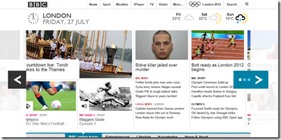
The BBC redesigned its web site last year borrowing elements of Microsoft’s Metro design language, as seen in Windows 8, Windows Phone, and Office 2013. Note the tiles, the typography, the horizontal scrolling, the way elements stand out against a pale background.
The BBC site is the 5th most popular in the UK and 47th in the world according to Alexa.
This strikes me as a significant design win for Microsoft. One of the goals of redesigns is to make your stuff look fresh and modern, while other stuff looks dated, and it helps drive an upgrade cycle.
Update: amended to clarify that the design update was last year. Details here and here. Also interesting to note considerable hostility from users. Another point of similarity with Windows 8!

But did Metro do this first or iPlayer? Its hardly the most original of design ideas.
I would be very surprised if there is not prior art for the Metro design. Maybe not identical, but very similar.