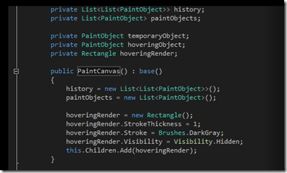
Many developers prefer to code against dark backgrounds, according to this post by Monty Hammontree, Director of User Experience in Microsoft’s developer tools division.
Many of you have expressed a preference for coding within a dark editor. For example, dark editor themes dominate the list of all-time favorites at web sites such as http://studiostyl.es/ which serve as a repository for different Visual Studio styles.
Chief among the reasons many of you have expressed for preferring dark backgrounds is the reduced strain placed on the eyes when staring at the screen for many hours. Many developers state that light text on a dark background is easier to read over longer periods of time than dark text on a light background.
Personally I am not in this group. A white-ish background works well for me, and if it is too bright, simply reducing the monitor brightness is an effective fix.
Interesting post though, if only for the snippets of information about the new Visual Studio. Apparently it has around 6000 icons used in 28,000 locations. Another little fact:
Visual Studio’s UI is a mix of WPF, Windows Forms, Win32, HTML, and other UI technologies which made scrollbar theming a challenging project.
If you will be using Visual Studio 2012, are you on the dark side?

Coming from DOS based IDEs of early 1990s, I cannot imagine programming with a light background. To my own surprise, I do use light backgrounds for editing/authoring documents of any other kind.
But don’t count my comment as a vote for the dark side, because I won’t be using VS2012.
I always use white background, but not because I prefer it, but because it’s very difficult, if not impossible, to adjust all the programs that I use, so I would have to switch from dark to bright all the time.
Many programs have options to customize colours, but not all of them do a proper job. Sometimes they ignore the OS settings, with weird results.