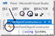
Microsoft has responded to user feedback by re-introducing colour into the Visual Studio 11 IDE. The top request in the official feedback forum was for more colour in the toolbars and icons.
Now Microsoft’s Monty Hammontree, who is Director of User Experience, Microsoft Developer Tools Division – it is interesting that such a post exists – has blogged about the company’s response:
We’ve taken this feedback and based on what we heard have made a number of changes planned for Visual Studio 11 RC.
That said, developers expecting a return to the relatively colourful icons in Visual Studio 2010 will be disappointed. Hammontree posted the following side by side image:
This shows Visual Studio 10 first, then the beta, and then the forthcoming release candidate. Squint carefully and you can see a few new splashes of colour.
You can also see the the word toolbox is no longer all upper case, another source of complaint.
Hammontree explains that colour has been added to selected icons in order to help distinguish between common actions, differentiate icons within the Solution Explorer, and to reintroduce IntelliSense cues.
Did Microsoft do enough? Some users have welcomed the changes:
You have to appreciate a company that listens to there [sic] users and actually makes changes based off feedback. You guys rock!
while others are doubtful:
with respect, I fear that the changes are token ones and that whoever’s big idea this monochromatic look is, is stubbornly refusing to let go of it in spite of the users overwhelming rejection of it.
or the wittier:
I’m glad you noticed all the feedback about the Beta, when people were upset that you chose the wrong shade of gray.
While the changes are indeed subtle, they are undoubtedly an improvement for those hankering for more colour.
Another issue is that by the time a product hits beta in the Microsoft product cycle, it is in most cases too late to make really major changes. The contentious Metro UI in Windows 8 will be another interesting example.
That said, there are more important things in Visual Studio 11 than the colour scheme, despite the attention the issue has attracted.


A step in the right direction – they’ve also gotten rid of the silly ALL UPPERCASE titles on all the windows….
But now they’re turning the menu bar into ALL UPPERCASE letters – how stupid is that?? Reminds me of mainframe and VC-20 days…. c’mon guys – we’ve evolved since then!
Little better, but not ok.
Looks like a trend.
Windows 7, Perfect
Windows 8, Sucks
Visual Studio 2010, Perfect
Visual Studio 11, Sucks
Luckily the next Office is an exception. But that one is more and more replaced by Google Docs.
“But now they’re turning the menu bar into ALL UPPERCASE letters – how stupid is that??”
Seriously. Bringing back some color to the icons is a welcome change but those all-caps menu headers are amazingly dumb, and painting active tab headers and the status bar deep blue doesn’t seem to be motivated by anything other than “look, we changed something!”
Microsoft should have just responded with a “f@*k you”, because that’s exactly what these pathetic “token” changes are.
More reason why Eclipse still owns this shit!