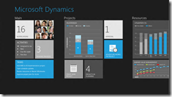
It is fascinating to watch the Metro-fication of all things Microsoft, from the Xbox 360 user interface to Windows Phone to Windows 8 to forthcoming versions of Office and other applications.
Future versions of Dynamics products were previewed at the Convergence 2012 event (which included a session called CRM goes Metro) and there are a bunch of screenshots here.
Microsoft calls Metro a design language and you can see its guiding principles here. Calling it a language does not seem quite right; the word “style” is more accurate, but it does have building block elements (and yes it is blocky) which I guess make it more than just a style.
A safe prediction at this point is that all Microsoft’s products will be touched by Metro influence, even though not all will become full Metro apps running on the Windows Runtime (WinRT).
In the past the style adopted by Microsoft for its own applications have strongly influenced third-party applications as well. Once Windows, Office, Dynamics and other apps have a Metro look, other apps that do not may begin to look dated or out of place.
Metro is controversial though, perhaps even more so than the Office Ribbon which replaced menus in Office 2007 and 2012. There is some connection: members of the Office team who worked with Steven Sinofsky on the design of Office 2007, including Julie Larson-Green and Jensen Harris, are now working with him on Windows 8. Harris has written extensively about the work on Office 2007 on his Office User Interface Blog, though the last substantial post was in 2008.
What’s not to like about Metro? Here’s a few arguments against:
- Beauty is in the eye of etc; but the blockiness of the Metro style does give it a utilitarian appearance. In Windows Phone 7 it is nice to use, but not so great to look at.
- The Live Tile concept, where shortcut blocks can be populated with current information, adds a random element to Metro start screens which does not always look good.
- The emphasis on simplicity and immersion makes Metro vulnerable to the accusation that it wastes too much precious screen space.
- Metro tends to be a horizontally scrolling style, though I am not sure if this is baked into the guidelines. This takes some adjustment since most of us are more used to vertical scrolling to see more content.
- Metro seems to be optimized for a touch UI, and while its advocates insist that it is just as good with keyboard and mouse, that is a stretch. Metro seems to be a big bet on touch as the future of human-computer interaction.
On the other hand, the usability of Windows Phone 7 is a point in its favour, and some are convinced. Paul Greenberg, in a positive take on Microsoft’s strategy based on his trip to Convergence 2012, says:
They have nailed UX (a.k.a user experience). Nailed it. Their combination of the extremely well done Metro interface and their work on natural user interfaces involving voice and touch is the new gold standard – and I’m someone who loves Apple products. (please, Mac fanboys, spare my life.)
I would be interested to hear from developers whether you expect to embrace the Metro style in your apps, wither in WinRT or elsewhere.

Not sure yet. I’ll embrace it if my customers ask for it, or if it allows me to do things I need to do which I can’t in the traditional Windows interface.
As an aside, I think Metro was first trialled in the form of Windows Media Center in Windows 7. I noticed that when I upgraded my main PC to W7 and tried playing music through the XBox, that the tiled interface was all over the place, especially when playing music albums. The current XBox interface is a natural evolution of that style.
Now, XBoxes can use Kinect and this interface works very well with that. So, perhaps one of the reasons we have this new styles is because Microsoft wants to see us using Kinects to control more than XBoxes…
We’ll be doing at least one substantial business app on WinRT. It will be fully Metro-style.
For desktop applications, we’re heading towards Fluent-Metro, the love child of the Office ribbon and Metro.
Given the consumer preview reaction, I don’t think it’s wise to invest in building a Metro application at this point. The general consensus from the customers I’m talking to are saying Windows 8 is a “skip it” release. I think we need to give Microsoft and it’s partners some time to ship devices before making the leap to Metro.
@Martin is there such a thing as Fluent-Metro or did you just make that up 🙂
Tim
@Tim Fluent-Metro is my name for an interface in the style of Microsoft Office 15. It is one of those pragmatic compromises that Microsoft describe as “no compromise”.
The one thing that really annoys me about Metro is too much use of ALL CAPS. Mixed case is simply easier to read.
I won’t even seriously consider till the bulk of the business desktops run something Metro enabled, to not piss off our Business users.
After that, well I don’t like it, don’t see the need for this massive breach of compatibility, but you never know, the market might force you.
… but I won’t be the first, since I don’t see how this will generate additional revenue.