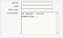
I’ve been messing around with web form design recently; started with a table layout, decided it was horrible and unmanageable so redid it with CSS. I came across this example which had more or less the layout I wanted – it’s the form about half way down that looks like this:

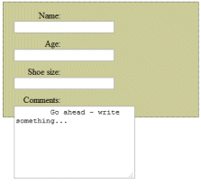
Looks simple enough; and is based on an idea by CSS guru Eric Meyer; so I copied the code and tried it. Unfortunately my version looked like this:

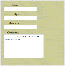
I squinted at the code again and noticed that a style defining a little hack called div.spacer was missing from the sample code though it is mentioned earlier in the article. Added it, and now my form looked like this:

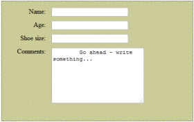
Better, but frankly not that close to what I wanted. What was wrong? Should the fields float:left instead of float:right? It made little difference. Then I noticed that the example on the page was real code, not just an image. I downloaded the actual CSS it was using. Of course it was an obvious error. The sum of the widths assigned to the label style and the field style was greater than the width of the containing div. Increase that, and all is well:

Great stuff; but it reminded me how tricksy CSS is. With both cascades and inheritance, and exceptions such as the fact that some properties do not inherit, figuring out exactly what style attributes apply to an individual element is a challenge. The positioning rules are complex and often do not work as I first expect. Styles can be defined in numerous places; and while external CSS files are easier to manage than those defined within HTML, they soon get long and hard to navigate.
By way of mitigation, CSS is powerful; yet as the above example shows, it can still need workarounds (div.spacer in this case) to achieve the result you want.
I suppose I’m waiting for that aha moment when it all makes perfect sense; but it seems a long time coming. Worried that it was just me, I found this reassuring post from Sho Kuwamoto:
I used to think of myself as knowing a lot about CSS. For starters, I’d been responsible for the CSS implementation in Dreamweaver. I was also a member of the W3C CSS working group. I wasn’t a major contributor (I didn’t author any of the chapters of the spec, for example), but I thought I knew the spec pretty well.
It’s been a while since I’ve touched CSS, and in coming up with the design for this blog, I was reminded again how difficult it is to use CSS to get the layout you want. It was incredibly difficult. I couldn’t get it to work and I ended up having to google around to figure out how other people had done their page layouts.
I’ve also noticed that the aforementioned Eric Meyer is increasingly critical of the language. In his post Wanted: Layout System he writes:
Maybe CSS isn’t the place for this. Maybe there needs to be a new layout language that can be defined and implemented without regard to the constraints of the existing CSS syntax rules, without worrying about backwards compatibility. Maybe that way we can not only get strong layout but also arbitrary shapes, thus leaving behind the rectangular prison that’s defined the web for almost two decades.
It’s too late of course. Now that Microsoft’s Internet Explorer 8 is out there is decent support for CSS across all the major browsers. What’s the chance of getting agreement on a new layout system now? The only realistic alternative is to work increasingly in Adobe Flash or Microsoft Silverlight, which is proprietary badness but can be attractive.
And I thought it was just me who spent hours trying to get the position of those pixels “just right”.
I feel a whole lot better about my skill set after reading this. I always kinda figured everyone was a whole lot better at CSS than I am.
It is a bit scary though that when we get stuck we all seem to turn to Google for help. How much power do they have over us if you really think about it?