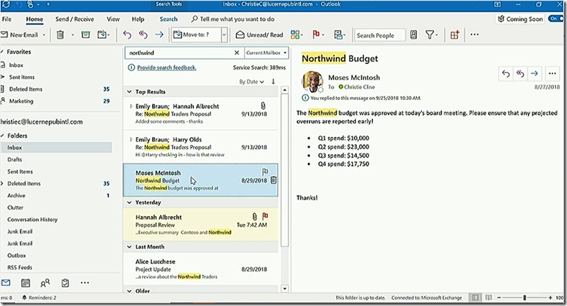
At its Ignite conference under way in Orlando, Microsoft has been talking about its plans for Outlook, the unavoidable email and personal information management client for Office 365 and Exchange.
A lot of UI design changes are on the way, as well as back-end changes that should improve our experience. One of the changes is that “AI-infused” search will surface top results, based on contacts we often communicate with, keyword matching and so on. Search is also getting faster; apparently it has already doubled in speed compared to earlier versions.
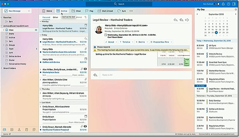
There will be a simplified ribbon, more use of colour, an improved calendar, and many small design changes.
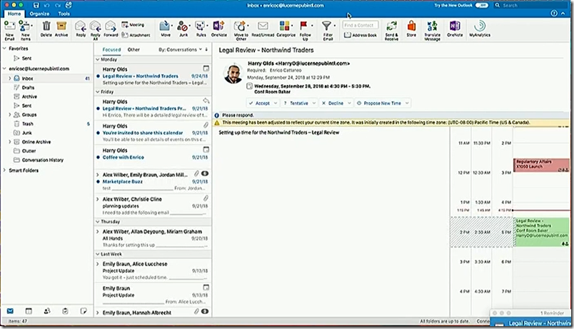
On the Mac, this is what Outlook looks like today:
and this is what is planned:
The background shading is caused by transparency, which is configurable.
Nothing is set in stone and the previews we saw are just that, previews. Microsoft is looking for feedback via the Office Insider community, as well as previewing features in the application itself and inviting opinions.
It’s good to see redesign work on this application which is essential to many of us. However it is not clear that the things which matter most to me are being addressed. I had a chat with the speakers at the end and mentioned the following personal bugbears:
1. Message formatting still gets messed up especially if you want to do things like replying inline to an email. If you click in the wrong place you can still end up inheriting formatting from the message you are quoting such that you cannot easily get back to normal typing. It is all to do with the use of Word for the message editor, but without all the features of Word to control it.
2. I’d like to see something in the UI that would deter users from quoting a massive chain of previous correspondence in the message, sometimes sending content unawares that would better have remained confidential.
3. Something many have asked for: delayed send, so that when you reply too hastily there is a window of time when you delete or edit the message before it is sent. Configurable, of course.
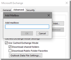
4. Attention paid to the many obscure dialogs, some of which have not been touched for decades. Like the Open other user’s mailbox control, which is not even a picklist, you have to type it exactly right:
5. Ever had a call from someone who has inadvertently engaged Work Offline and does not know why mail is no longer arriving? I have.
6. In Outlook mobile, at least on Android, search is infuriating. It retrieves results, but if they are more than a couple of weeks old, you cannot see the message.
7. Better performance when your connection is poor. I realise it is challenging, but you would think that proper use of background processes could give the user a reasonable and informative experience. Whereas today you can get hangs, lies (“this folder is up to date”, when it is not), that certificate warning when you are on public wifi and have not logged in yet (why can’t Outlook detect this common scenario?), repeated password requests when there are network problems, and so on.
8. Why are Outlook profiles managed in a Mail applet in Control Panel? Admins know this, but why not make it an Outlook Configuration app that appears in the Start menu. It would be easier for those who get stumped when Outlook does not open.
I am sure you have your own list. The bottom line though is this: the cosmetics of the design do matter, but not as much as issues which can stop you getting things done.


