I have been running Windows 8 Consumer Preview on a dual-monitor desktop today. I encountered several annoyances. In no particular order:
The Start Menu
If you are working on the desktop, being dumped back in Metro every time you need the Start menu is disconcerting. It is not so bad on a touch slate, because the Metro Start menu is easier to use, but if you are using keyboard and mouse it is more annoying.
I am beginning to understand why this is. Conceptually, the Desktop is a Metro app, therefore it makes sense to start it from Metro. If Windows gets to the point where desktop apps are only used occasionally, this will work fine. Right now though, the desktop side is unavoidable. Explorer, full IE, Control Panel, even the Help app is a desktop app. This is a transitional thing that will be a long-lived annoyance.
This little issue also confirms Microsoft’s belief that touch and tablet really is the future of Windows. It is the big bet.
Horizontal scrolling
Windows 8 Metro has a lot of horizontal scrolling, the Start menu being one example. Swiping this with fingers feels natural, but using a scroll wheel on a mouse is odd because you expect that to give you a vertical scroll. There is a scroll bar as well, but the mouse wheel is easier.
App switching
App switching has been messed up in Windows 8. Long ago, users of Windows 3.1 used to complain that they lost the app they were working on. In reality, what used to happen was that Word would be running behind Excel, and they did not realise that Alt-Tab would bring it back, or forgot that Word was running. Sometimes users would open multiple instances of an app just to get it back. I wonder if we may see a return to this problem in Windows 8? The taskbar in Windows 95 was invented partly to solve it, but the taskbar no longer works because Metro apps do not appear there. If you are in Metro, you do not see the taskbar anyway, of course. Alt-Tab works fine, but users do not always think of that.
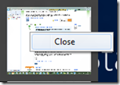
An interesting twist on this is that the desktop, from the Metro perspective, is a single app. Therefore, if you are in Metro and summon the column of running apps by moving the mouse to the top left corner and dragging down, only one desktop window shows even if you have several desktop apps running. Oddly, you can “close” the preview desktop app here, but it does not close the desktop or any desktop apps if you do, just removes it temporarily from the preview window list.
App menus and context menus
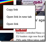
In Metro on a tablet, you raise application menus by swiping from the top or bottom. That works well, but when using the mouse you are meant to right-click instead. The snag is that right-click isn’t ideal for bringing up app menus as it might need to show a context menu. For example, in the Metro browser right-clicking a link brings up a context menu:
In this case then, the right-click does NOT bring up the app menus, such as the tabs and address bar in IE.
The Music app
The Music app looks great, but I have struggled to add any music to it.
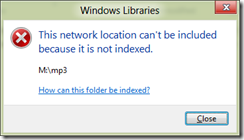
My music files are on a network share. There is no setting in the Metro Music app to add a folder to the library. It looks like you are meant to go to Explorer on the desktop side and add folders to your Music library. However, when I tried to add the network share I got this error:
“This network location can’t be included because it is not indexed.” Follow the help links, and you eventually get to instructions for working around this problem by creating a local folder, adding it to the Music library, then deleting the folder and recreating it as a symbolic link to the network share. Hardly a user-friendly operation, but in my case even this did not work. I am now trying to index the share on the server, but it is still not working.
I do not see DNLA streaming support here either. Maybe it will come; otherwise you will have to go back to Windows Media Player, or a third-party app, to get full features.
Metro Mail problems
I have not yet managed to get the Mail app to work with Exchange. One of the annoyances here is that when it fails to set up the account, it does not give you a reason. A bit of research suggests that it is an autodiscover problem.
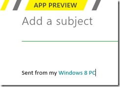
Another Mail issue is that you cannot modify the annoying signature, Sent from my Windows 8 PC:
Nor can you use POP3 or IMAP, or forward mail. I was relieved therefore to find this statement from Microsoftie KeithF on the Answers forum:
We aren’t anywhere near done with the app and, as you’ve seen, there are some things we haven’t gotten to yet. One of those is supporting custom domains and aggregated POP accounts correctly. We’re working right now on finishing this off the right way.
This is worth noting because it gives hope that more features will arrive in the other apps as well. Currently they seem only part-done.
Multiple displays
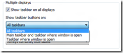
Multiple monitor support is odd. The taskbar now extends across multiple screens, but annoyingly it is not properly extended, just sort-of copied, so you cannot add more shortcuts without scrolling. There are some other options, like “Show taskbar buttons on Main taskbar and taskbar where window is open.”
There are oddities though. A Metro app apparently cannot be extended across two displays. The Start menu appears in one display, letting you work on the other, but if you have a desktop app stretched across two displays, the Metro side will overlay that part of the desktop app which is on its display.
Metro Messenger
Another app deficiency is that in the Metro Messenger app you cannot add a new contact, at least, not that I have seen.
Conclusion: not done yet
Windows 8 is not yet done. While I am not expecting any great change in the Start menu or essential mechanics and design of Windows 8, I do expect improvements in the Metro apps, the goal I suspect being to make this usable and enjoyable on a tablet without too many jarring visits to the desktop – though if you use Office, you will be going to the desktop a fair amount like it or not. We have yet to see what Microsoft will do in Office 15 to mitigate this.
A few days in, and I still believe that the Windows 8 compromise means that the Metro side is sub-optimal with Mouse and keyboard, and the Desktop side sub-optimal with touch.
There is a ton of promise though, and much depends on what Metro apps appear, and how successful Microsoft is at fixing deficiencies in time for the launch. Given the lead time needed by OEMs, there is not a lot of time left if this is going to be a 2012 operating system.

“This little issue also confirms Microsoft’s believe that touch and tablet really is the future of Windows. It is the big bet.”
Apparently so, but that makes no sense. Windows has a huge corporate user base, and programmers and other professional users are going to stick with mouse & keyboard and desktop applications and big monitors sitting on a desk, at least for a very long time to come. I’m sure tablets will become more popular as well, but that common desktop usage scenario is not just going away by 2013.
I haven’t tried this preview myself since it won’t work in Virtual PC but from what I’m seeing, this is not a system I would want to use on a desktop, nor one that any company would ever want to migrate to. That’s also the majority of the feedback I’m hearing. Now I can’t help but wonder — does Sinofsky simply not realize this? Or is Windows 8 merely intended as an experimental release that will provide feedback for the next release?
Chris
It’s possible that Microsoft isn’t too worried about desktop users staying with Windows 7. If they have not already switched to Mac, they probably will not do so now. More important to make inroads against the iPad.
Tim
I agree with your comments 100% – W8 is good (ish) on a tablet but poor on desktop and very hard work.
BTW I had loads of issues with Mail but solved them but not including https:// in the server address
Hope that helps
Mike
Win8 *might* work on a tablet – but with this butt-ugly Metro UI, it’s alienating all corporate users, power users, and really: what do I need a touch UI for on a e.g. Exchange server machine !?!?!? I’m afraid MS might have taken too much of a plunge here – if they don’t bring out a “regular” Windows version – sans Metro – they might not be getting hardly any takers at all …..
Who care if Metro is running on an Exchange Server machine? You can administer it remotely. It should not matter what UI is loaded (if any).
The multimon problem comes from the fact that the taskbar is dual-purpose. It is both a program launcher, and a window switcher. As a window switcher, it works great. In other words, it works exactly the way that third-party multimon taskbars like Ultramon and Displayfusion work, and the way that the multimon taskbar in Longhorn worked before it was removed in the reset. (Yes, this feature is literally *TEN YEARS* in the making. Now if they could fix MDI on Excel …)
“This little issue also confirms Microsoft’s belief that touch and tablet really is the future of Windows. It is the big bet.”
Yes, I think Tim has it exactly right. I would guess that MS has run the same numbers that Horace Dediu has run, where he projects that, given current trends, the tablet market will exceed the traditional PC market in fall 2013.
http://www.asymco.com/2012/03/02/when-will-the-tablet-market-be-larger-than-the-pc-market/
Thanks.
-Phil
Microsoft totally removed the Start Menu from Windows 8. Rizonesoft decided to petition Microsoft to at least give us a choice between the old and new interfaces. However, for this petition to be successful we need a few million signatures; this seems impossible, but can be done. Remember; only those who can see the invisible can accomplish the impossible. Petition: http://www.gopetition.com/petitions/bring-back-the-windows-start-menu.html
I’ve been using the preview on a variety of machines. On my Acer Iconia tablet – not the best tablet for Win8, sadly, especially given its 1200×800 screen res, but still workable – I’ve found myself staying almost entirely in Metro, as you’d expect. But I’ve only used it for a bit of Web browsing and reading mail. So far, so iPad. On my main desktop at home – which is actually a docked Vaio laptop – I’ve found myself almost entirely on the desktop, just as if I were still running Win7. I’ve started using Win+R reflexively to start Win32 apps from the Run box. I haven’t even bothered to set up most of the Metro apps or customise the Start screen. There are almost no apps included in the Preview which I don’t already have a Web site or installed solution for. If I want a map, I’m going to go to Google Maps, not open the Metro Maps app, which is OK but really not compelling enough to make me want to use it over the solution I already have that works well for me. OTOH, if I were using Windows 8 on a TV, as a ten-foot interface, Metro would be lovely. Give me Kinect support so I can gesture at it in the same way that I can touch a tablet, and I’ll be sold.
Tim – I echo your thoughts about multi-monitor support. It’s always been remarkably poor in Windows, given that so many power users have multiple screens, and it’s poor in this build. The ‘Metro on one screen only’ thing bugs me more than I can articulate. It would be great to be able to snap two, three or four Metro apps across two or more screens. But if they’re going to stick with Metro on the primary screen only, then at least make the other screens blank out when you’re using Metro. Seeing half my desktop is distracting.
I dare say I’ll get used to a more mixed way of working as and when there are really compelling Metro apps I want to use. I mean, I used to use Windows a whole different way back in the days of IE / Explorer equivalence – I was forever typing into the Address toolbar on the taskbar. I used to type paths out in Explorer rather than browse to them. People use Windows in all kinds of different ways, and – while they may moan about change – they adapt to it pretty well.
I figure we’ll know if the great gamble has paid off when we see the sales figures of the first round of Windows on ARM tablets. The iPad is going to be tough to beat, or even compete with, given the head start it has.
My main PCs have touch screens, my desktop is an AIO with single-touch and my laptop is a convertible tablet with dual-touch. In both cases I generally just use it for scrolling web pages, something Windows 7 is perfectly capable of (as was XP).
The thing is, if I am using a PC its because I need the functionality of a PC. If I wanted a tablet I would be using something else, as my convertible is just too bulky. Having Metro imposed on me so far has just been really annoying, and knowing people who went mental every time the start menu slightly changed (which seemed no big deal to me) I can see it going down REALLY badly with an average user.
I just can’t see Metro offering anything better than you can already get on an iPad or Android Tablet. I suppose if you have a Windows 8 tablet with a dockable keyboard and mouse it could be useful to be able to use it as a full desktop, but the fact Windows 8 is going to run on ARM makes me think most tablets would be on that platform which kills that ability. What is the point of the desktop if it can ONLY be used for office?
I am also totally unimpressed with how they have supposedly been harmonising all Microsoft products with Metro.
Why convert the Xbox to Metro and then refuse to give us the single most useful feature, the ability to customise the layout. It breaks the whole argument that all Metro devices should work the same, because they really don’t.
On a 22″ monitor, Metro is quite frankly unusable for any significant period of time, or they would need to drastically tone down the colorfulness and the size, improve the smoothness of transitions, etc.
On the tablets, I’m not convinced either, if you use only a handful of apps, it works, but beyond that you just end up doing too much horizontal scrolling. The metro blocks are both too huge to serve as proper navigation icons, and too small to display content properly.
Android has the best balance IMHO, the icons+widgets approach is more practical, especially with a navigation ala HTC Sense on top of it (rather than the simple horizontal navigation like in Honeycomb).
Windows 8 is shaping like another Vista for me, in different ways, but in the end, more annoyances than progress. Good thing Win7 is stable enough to be another WinXP.
Have you actually tried Windows 8 on a tablet, such as the BUILD hand-out? It is actually nice to use, more so than Android IMO.
Tim
I wonder if it’s possible to simply create shortcuts in the desktop (or taskbar) to the desired Start Menu items, avoiding it itself.
Either that or someone is going to come up with some tweaking app.
Stardock is already working on a Start Menu replacement for the Win8 CP. ATM it looks like a pop-up version of the Mero Start Page, but of course it’ll be themeable.
I really like Win8 Metro for Tablets and Laptops.
However, it’s a total annoyance for any desktop user.
IMO, Microsoft could make this much better if the user could specify the default startup environment being either Metro or Desktop.
I have been running Windows 8 in VMWare player for a few days now. Initially the lack of start menu was killing me, but I am starting to enjoy the big colourful tiles. It certainly needs a good polish, but it could be useful in a corporate environment as long as we can control metro apps centrally. Not sure we want everyone playing cut the rope all day.
For corporate environment, I think that METRO can still be usefull a lot. Regular users have their roles, their tools. So admins can prepare customized set of live tiles (even as special add-ons even for their legacy desktop apps) which even can peek and show some important notifications on single “employee role dashboard”. So live icons with fancy “You have a [#] mail(s)” (as in almost every IT related movie :-), “There is # of new tickets to solve”, “# of invoices to pay” … In fact, this returns slighly back to old DOS, where many of us had created such limited sandbox menus for users (free-flight windows like desktop with lot of program and document icons was often nightmare these days, or not?).
Power users are different story, they need classic start menu back in some way and can run many METRO apps virtually under HyperV in windows laid out on desktop.